Pantone’s Color of the Year
- By Flooring Liquidators
- Dec 21, 2018
At the end of every year, we watch the headlines closely to stay on top of the trends that some of the biggest names in the design industry project for the coming year. One major trendsetter is Pantone, US-based maker of colorful paints and products and the namesake of the Pantone Color Institute.
Each year since 2000, the Pantone Color Institute has declared a Pantone Color of the Year. Combing the globe for color influences, the institute looks to everything from trends in pop culture and film, to the most popular travel destinations at the moment, to the world’s general socio-economic conditions, to organic elements, art, fashion and much more for inspiration.
While Pantone makes it clear that they’re not forecasting, but merely observing trends, the color they choose then goes on to have a great deal of influence on the products purchased and decisions made by consumers and designers alike for the rest of the year. This impact spans across industries including fashion, industrial design, product packaging, graphic design, home goods and more.
In particular, we pay attention to the impact that the color of the year has on interior design and décor, including within the flooring industry. Color is just as present in flooring as anywhere
– from a vast spectrum of carpeting and area rugs to the wide variety of grays, browns, blacks, whites and other neutrals that characterize categories like hardwood and tile.
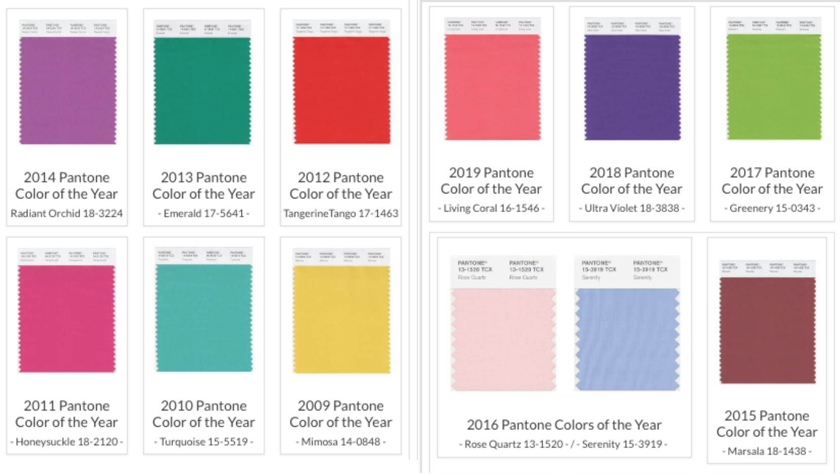
A decade of Pantone’s colors of the year, from 2019’s Living Coral to 2009’s Mimosa.
Pantone’s colors from years past have always had a signficant influence on designers. The Pantone Color of the Year is about more than just a look – it’s about a feeling and a moment in time. The vibrancy of 2017’s Greenery, for example, was chosen to inspire new beginnings and offer calm.
Sometimes, the institute surprises everyone with an unexpected choice, like 2016’s Rose Quartz & Serenity – these two separate, but harmonious pastels balanced warmth and coolness, creating a trend of order and peace. This marked the first, and so far only time that Pantone introduced two shades at once for their Color of the Year.
For 2018, Pantone chose Ultra Violet, a deep and mysterious purple hue that symbolized individuality and mystery, offering a lifted state of mind for an over-stimulated world entrenched in technology. It also stood for non-conformity, inspiring designers to get creative and think outside of the box.
If you look at last year’s Ultra Violet and think you wouldn’t know where to start with designing with such a bold tone, it’s easier than you might think! Rather than decking out your entire room in bright purple hues, we always recommend subtler touches. Area rugs, accent walls, and other décor are all great places to incorporate trendy colors without going overboard.

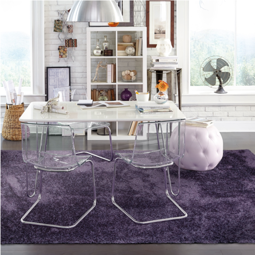
Oriental Weavers Cosmo in Purple set a dark, neutral tone that blends well with dark, woo-look flooring last year.
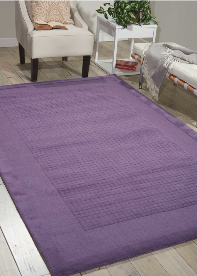
Another Purple accent was Nourison Wesport, a lighter shade that contrasts beautifully with light grays and browns that are still trending into the new year!
Whether your goal is to blend or contrast colors into your design, Pantone’s Color of the Year always provides plenty of versatility to do so! So, now that we’ve looked back on 2018… what will 2019 have to offer?
Introducing the Pantone 2019 Color of the Year
This year’s color rides the line between vibrant and mellow. Living Coral is a warm mix of pink and orange that Pantone claims will embrace us with “nourishment to provide comfort and buoyancy in our continually shifting environment.”
It is a joyful color, at that. Playful and tropical, it’s a color that will be sure to energize whatever room you use it in. Designers at the Spring/Summer 2019 New York Fashion Week are already gearing up to utilize Living Coral as a color that is bold, empowering and confident along with uplifting. Beyond seasonality, the color is projected to offer fashion designers with authenticity. That mindset in the fashion world is sure to translate into the realm of interior design as well.
The Pantone Fashion Color Trend Report for Spring 2019 has moved away from the bright, pastel tones of 2018. It includes a variety of classic, bold colors and neutrals to support Living Coral in design. These include fiery reds, warm oranges and greens, refreshing golds and even a royal blue, with names like Fiesta, Tumeric, Pepper Stem, Toffee, Sweet Lilac and Mango Mojito.
The neutrals, meanwhile, include organic beiges and earthy browns, along with deep, night-sky purples, in hues like Soybean and Sweet Corn. This selection is a brilliant example of how the Pantone Color of the Year never simply stands alone – in home design, it’s crucial to strike a balance of many colors to achieve the look you want.
Decorating with Living Coral
Living Coral is vibrant, without being overpowering – making it a highly accessible color for designing both indoor and outdoor spaces. Here are a few examples of the tone at work in patio settings.
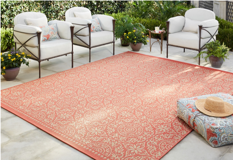
Mohawk Oasis area rug in Bundoran Coral.
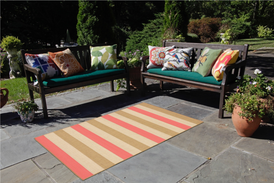
Liora Manne Terrace area rug in Multi Stripe Orange.
As you can see in both of these area rugs and the settings in which they’re sitting, a range of color combinations is possible with Living Coral. In the first photo, the light white patio and furniture help the rug to stand out, while its beige tones keep it from overwhelming the space. In the second photo, the patio is darker, and the rug features much more distinct lines between each color and neutral tone. A variety of colorful accent pillows offer contrast that works with, not against the rest of the space.
In short, get creative! There’s no one way to use Living Coral, and we’re excited to see how some of our favorite designers take advantage of it.
Explore more area rugs and flooring to pair with them. Flooring Liquidators offers hardwoods, laminate, vinyl, and tile flooring to complement Living Coral.


Validate your login